TemplateUltra-Minimal Portfolio
Mono
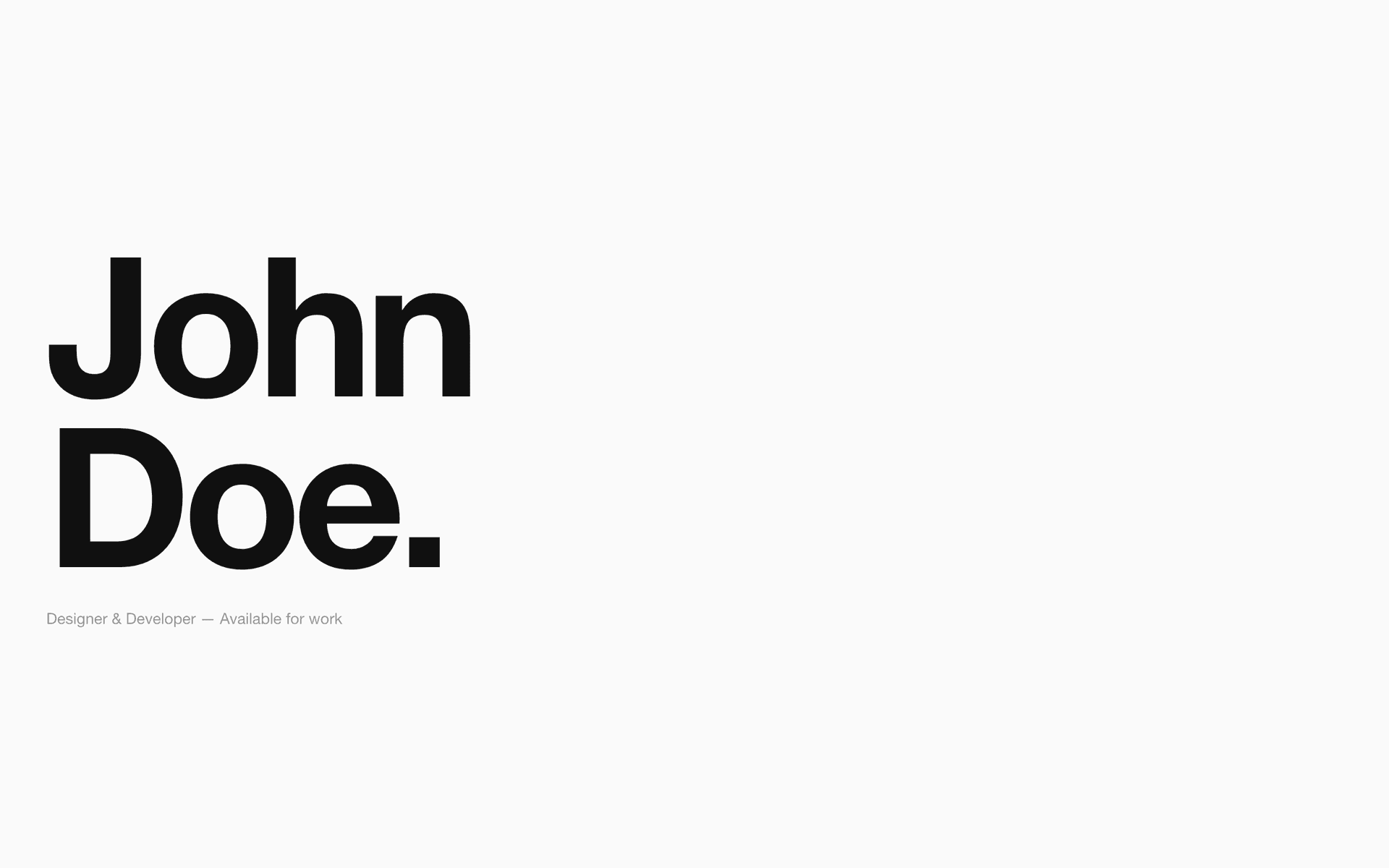
Extreme minimalism. One font, zero decoration, black on white. Project titles ARE the navigation. For designers, developers, and creatives who let their work speak for itself.
Coming SoonLive Preview
01 / DesignWhy it looks this way
01
One Font: Syne
One typeface, five weights. Hierarchy through scale alone — 200px heading, 16px body. When you remove font variety, scale becomes the entire design system. Inspired by Steven Mengin (Awwwards SOTD).
02
Zero Decoration
No icons. No illustrations. No background colours. No gradients. No borders except functional dividers. The negative space IS the design. Everything on screen either communicates or it's deleted.
03
Project Titles as Navigation
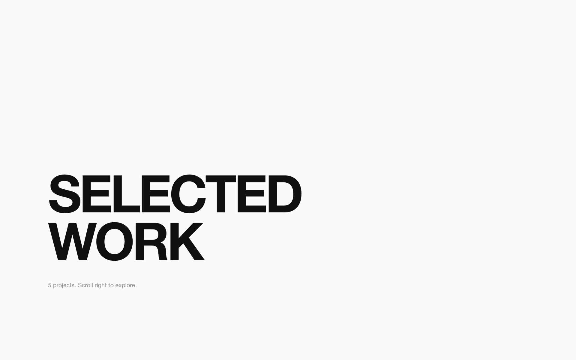
The work section IS the portfolio. Project titles at 80px are both content and UI — click any title to view the project. No cards, no thumbnails, no grids. The names do the work.
04
Hover Accent (#FF3D00)
The only colour on the entire page. It appears ONLY on hover — project titles, email, social links. This single interaction point makes the monochrome meaningful. Without it, the site is just boring. With it, it's a reveal.
05
The About Is One Paragraph
No skills section. No timeline. No 'my journey' essay. One paragraph that says who you are, what you do, and where to reach you. Because a minimal portfolio should be as confident about its words as its design.
02 / UXDecisions that drive conversion
Title-as-Link Pattern
Project names at 80px ARE the clickable elements. No separate buttons, no 'view project' links. The content IS the interface. Reduces UI noise to absolute zero.
No Page Transitions
Instant page loads. No fade-ins, no loading screens. Minimal means fast. Every animation you add to a minimal site dilutes the minimalism.
Single-Column Flow
No grids. No sidebars. One column, top to bottom. The eye travels in one direction. Reading a Mono site should feel like reading a book.
03 / IncludesWhat ships
5 sections (Nav, Hero, Work, About, Contact, Footer)
Single-font type system (Syne, 5 weights)
Hover-only accent colour system
Project title navigation pattern
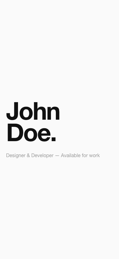
Mobile-responsive with preserved minimalism
Accessible contrast ratios (WCAG AA)
Next.js + Tailwind source code
1-click Vercel deploy
—Deliberately excluded
No project thumbnails — the names speak for themselves
No skills/tools section — your work demonstrates your skills
No testimonials — minimal means only what's essential
No blog — if you need a blog, this isn't the template for you
04 / Audience
Designers, developers, photographers, architects, writers — anyone whose work is strong enough to stand without decoration.
Design References
stevenmengin.comdennissnellenberg.commathieulehanneur.frchristianklassen.comsamuelday.com
Get Mono.
The portfolio template that proves less is more. Source code for people who trust their work.
Coming SoonOr hire me to customise it for you.
WHAT YOU GET
Full Source Code
Next.js + Tailwind + TypeScript. Every page, every component, every animation.
4-5 Complete Pages
Home, About, Services/Work, Contact — and industry-specific pages. Not just a homepage.
GSAP Animations
Real scroll-triggered animations on every section. Not CSS transitions — choreographed GSAP motion.
Fully Responsive
Mobile-first design. Same quality on phone, tablet, and desktop. Tested across breakpoints.
SEO-Ready
Semantic HTML, proper heading hierarchy, metadata structure, Open Graph tags ready to configure.
Customisation Guide
Step-by-step docs for changing colours, fonts, content, connecting a CMS, deploying to Vercel.
Design Decisions Doc
Why every visual choice was made. Typography rationale, colour reasoning, animation philosophy.
License for Everything
Use on unlimited personal and client projects. Modify however you want. You own your build.
Lifetime Updates
Buy once, receive all future updates. Framework upgrades, bug fixes, new features.
BUILT WITHNext.js 16Tailwind CSSTypeScriptGSAP ScrollTriggerSplitTypeVercel-ready
One-time purchase. Lifetime updates. No subscription.
Coming Soon
14-day refund guarantee
If the template doesn't work as described, email us for a full refund. No questions.